Livable Residence Evaluation System
Background
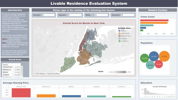
With the increasing population flooding into New York City, finding a livable neighborhood has become a significant concern for many people. However, the process of selecting an ideal living place is not straightforward. There are many factors that can affect their choices of living places, such as housing prices, crime rates, population, and education.
Furthermore, individuals may have different priorities and preferences, which can further complicate the selection process. For instance, some may prioritize access to public transportation, while others may prefer proximity to green spaces or cultural amenities. It is a challenging task to build models that can accurately capture the different factors and weightings to provide personalized recommendations to individuals seeking to find a suitable neighborhood. In this project, we will create a system that can help people decide which neighborhoods are better to live in based on their priorities and preferences.
Design
The dashboard is constructed using one major geographic plot showing the score of each neighborhood, together with several supplementary plots presenting the distribution of the scores for each neighborhood. The dashboard is designed to be interactive so that users are allowed to rank the four factors based on their preferences and select each neighborhood to look for detailed information. Based on the four factors, we will use a weighted sum to calculate the overall score for each neighborhood. In our evaluation dashboard, users will first rank these aspects from 1 to 4, and assign weights 0.4, 0.3, 0.2, 0.1 respectively.
Evaluation
An important component of the dashboard design is evaluation. We invited students and friends to test the Livable Residential Evaluation System by imagining they are planning to move to NYC, and using our tool to help choose a neighborhood. The user test helps us to validate whether our solution meets the needs of real users and provides suggestions for our future work. Our user test includes the following questions:
- What is your first impression of this interactive visualization?
- How easy is it to navigate through the interaction?
- Did you encounter any difficulties when finding a place you want to live in NYC?
- Do you think it helpful for living evaluation? Why or why not?
- What else do you want to say to improve interactive visualization?